Constant Contact is a popular email marketing platform targeted towards empowering small businesses and non-profit organizations. Its goal is to create a valuable marketing tool offering various campaign features to help these organizations level the playing field against large corporations.
I teamed up with 3 UX designers to modernize Constant Contact’s UI design and improve the overall experience of the email campaign creation and management task flow.
TIMELINE
3 Weeks
ROLE
UX research, personas, wireframing, UI, usability testing, prototyping
TOOLS
Whimsical, Sketch, InVision
PROBLEM
Small organizations want to easily promote and grow their business via email marketing but struggled with managing their campaigns on Constant Contact’s platform.
SOLUTION
Making the email campaign management process more intuitive and efficient would be vital in driving the success of these smaller organizations due to their limited resources.
Having a beautifully designed platform would further elevate users’ overall experience.

RESEARCH
The first step in the research process was to obtain an overall understanding of the email marketing industry through independent and user research. This was further supplemented by understanding Constant Contact’s business and branding goals. Various research methods were utilized to gather our data.
2. Contextual Inquiry
We observed 10 users create and manage an email marketing campaign using Constant Contact’s platform while completing tasks with commonly utilized features. Even though this was a more time-consuming research method, we decided it was important for us to observe user interactions with the platform so we could better identify the key problem areas. It provided us with unique observations and the ability to gain direct insight into user thought-processes.
1. Online Surveys & In-Person Interviews
We surveyed 12 email marketers with varying degrees of experience and interviewed 4 additional email marketers to obtain an understanding of their demographics, preferences, feature usage, and overall email marketing process. The data gathered from these surveys and interviews helped us design specific tasks for our contextual inquiry testing.
3. Heuristic Evaluation
My team and I also performed a heuristic evaluation of the platform to evaluate the usability of the platform at its current state.
4. Competitive Analysis
A feature comparison was performed for Constant Contact and its competitors, which included Mail Chimp, Sales Force, Hubspot to name a few.
SYNTHESIS & KEY INSIGHTS
We synthesized the data via affinity mapping to organize our observations and isolate the pain points users were experiencing with the overall platform as well as for each step of the creation and management process. From this, we were able to narrow down users’ overarching problem to a single statement.
I have summarized the key insights into 4 overall points below.
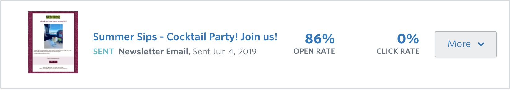
Insight #1: 100% of users track campaign performance
Users prefer having quick access to analytics and wanted it to be displayed prominently to make campaign management easier. The most important analytics for majority of users were the open and click-through rates for managing campaigns.
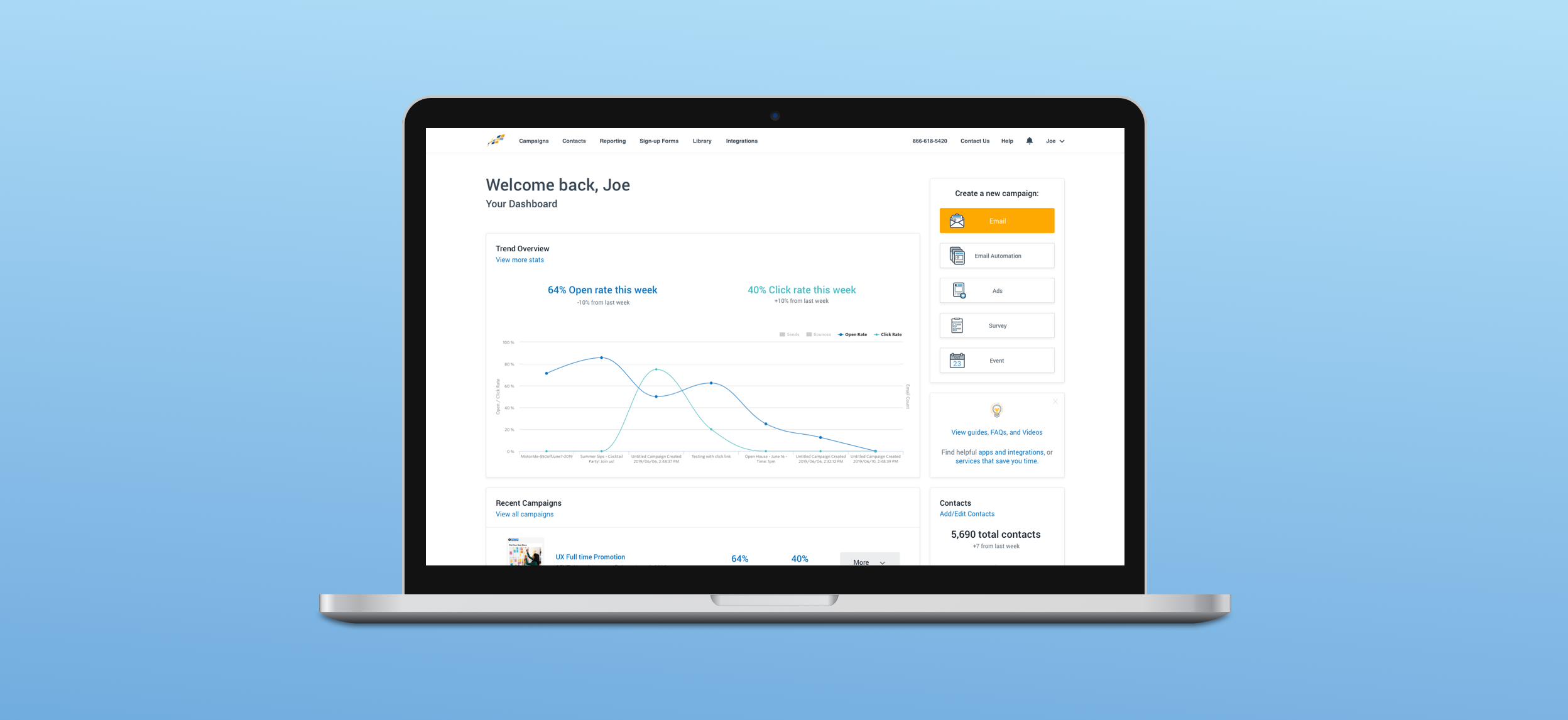
Insight #2: Lack of direction
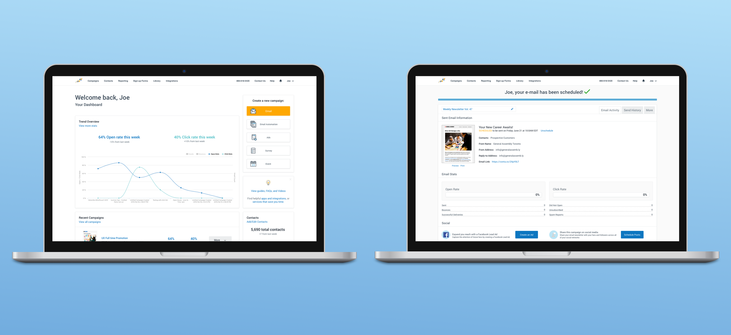
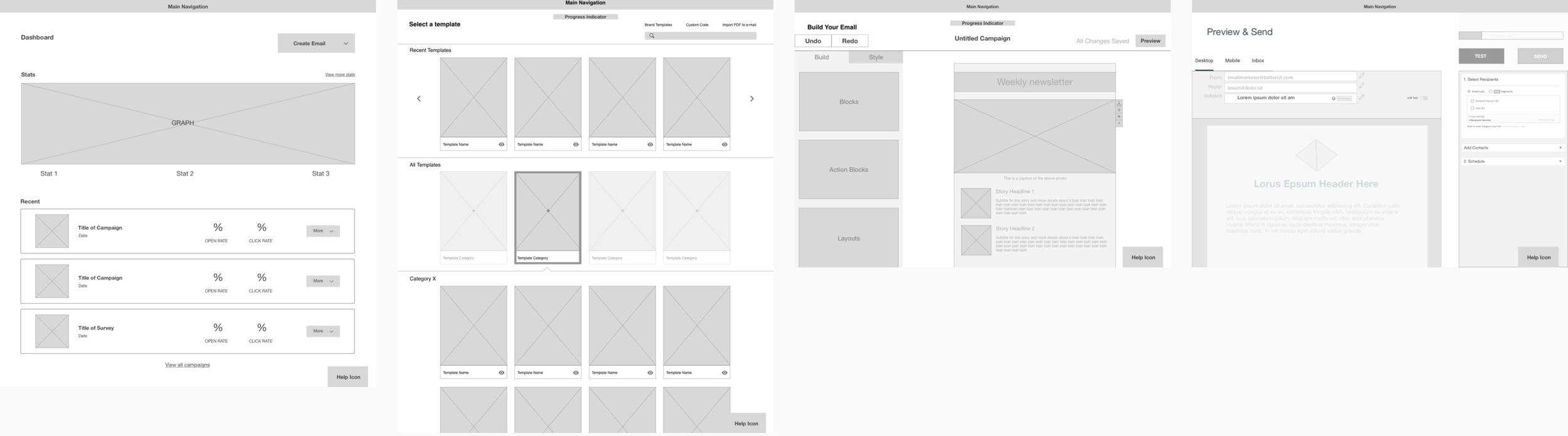
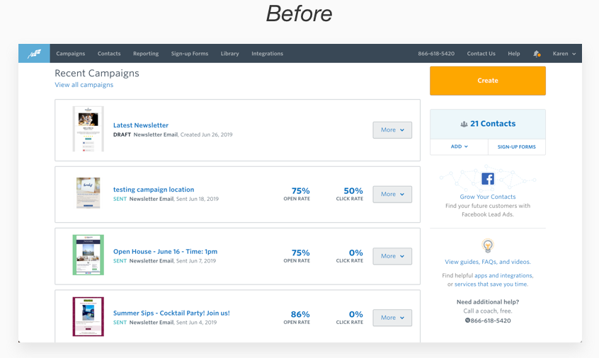
There was a lack of communication to users throughout Constant Contact’s platform. It was unclear to users what page of the site they were on, particularly on the Dashboard page, which is shown in the image below. Further, during the new campaign creation process, there was no progress indication showing users how far along the process they were.
Insight #3: Inefficient & overwhelming
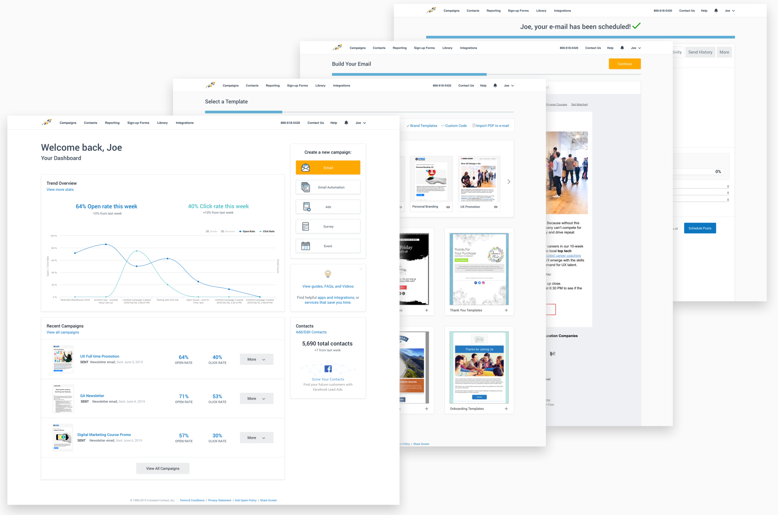
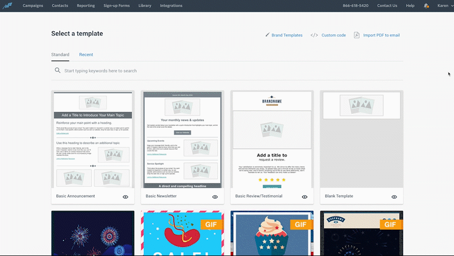
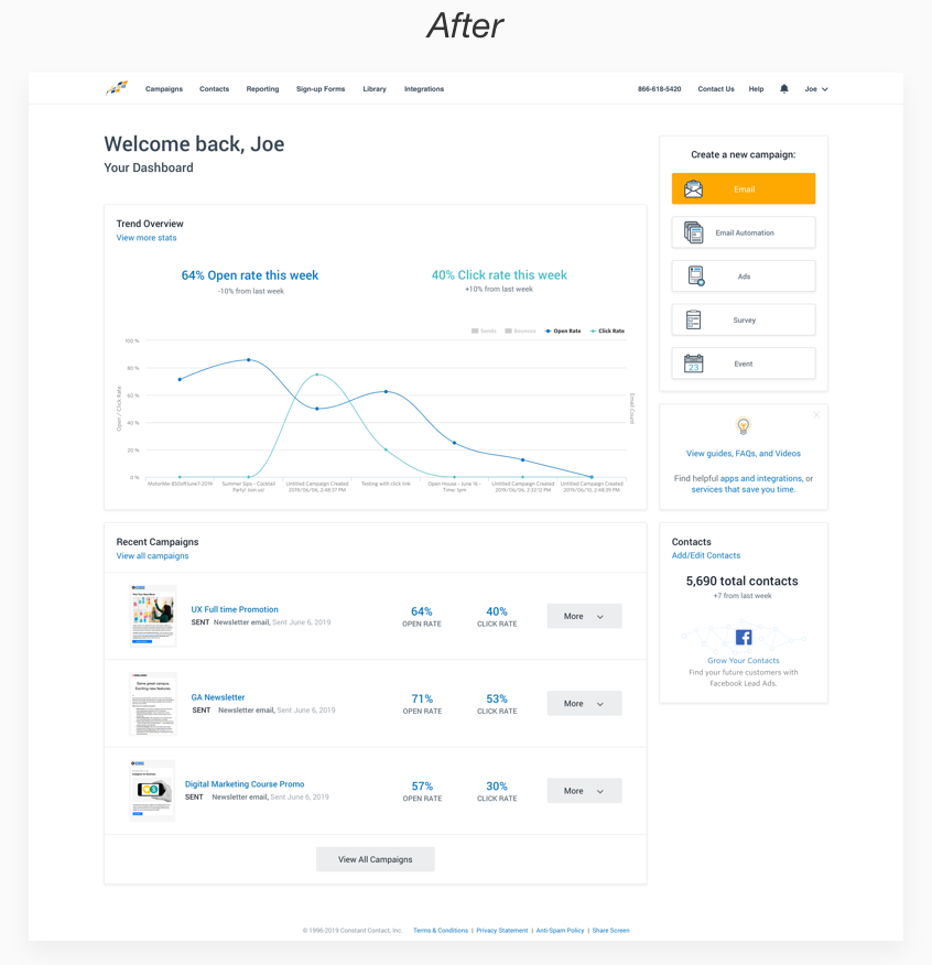
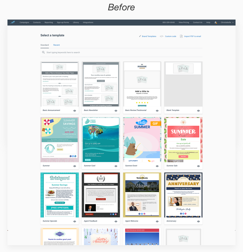
Simple tasks at various points in the process required an unnecessary amount of steps to complete. This inefficiency was amplified by the platform’s busyness and unorganized layout. For example, the first step of the new campaign creation process brought users to a template selection page where they were hit by an unendless scroll of uncategorized templates as shown below.
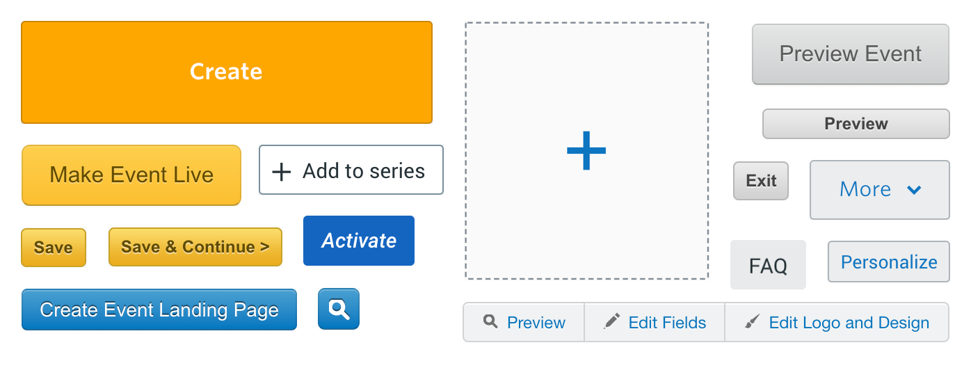
Insight #4: Overall negative user response to UI
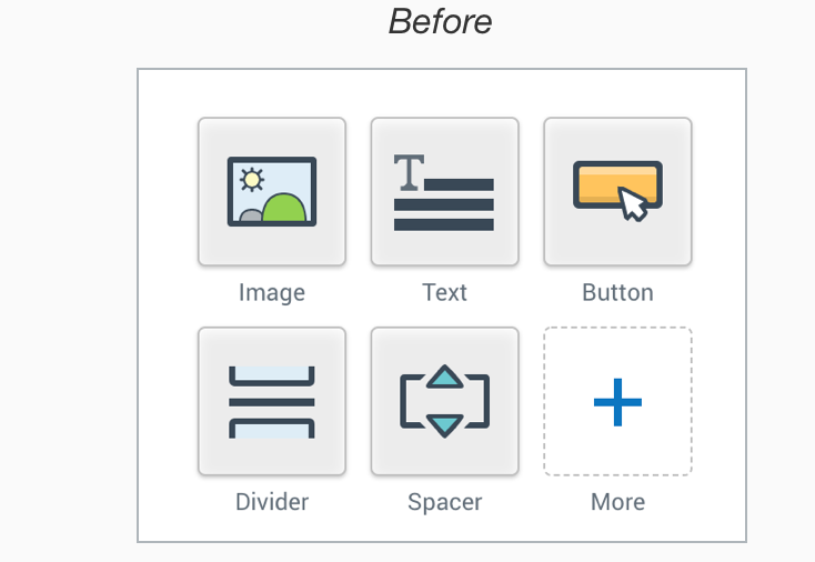
Users described the platform’s UI as being outdated and clunky. The UI was inconsistent throughout the platform, further reducing the efficiency with which users navigated throughout the site. Below is a compilation of the various call to action buttons from the platform.
USER PERSONAS
Our research data helped inform the user personas for us to focus our redesign decisions on. At a high level, they were:
1. the experienced email marketer who works for a small corporation, and
2. the beginner who is an entrepreneur running her own small business.

IDEATION, SKETCHING & WIREFRAMING
Due to timeline constraints, we chose to focus our redesign on recurring pain points that a majority of users were experiencing. We explored how to address the various user pain points via sketches and quickly moved on to low-fidelity wireframes so we could test our solutions with users.
It was important for us to ensure our improvements did not stray too far from the existing branding and business goals of Constant Contact.
TEST, ITERATE & REPEAT
3 rounds of usability testing and iterations were made based on collected data before finalizing the prototype. For each round of testing, various methods of testing were utilized.
1. A/B Test
A/B tests were used for various elements of our re-design, including user preferences for the dashboard layout and progress bar style.
2. First Click Test
Part of our redesign included a change in the layout of templates and modifications of CTA buttons. We used a first click test to check whether our redesign was clear and intuitive to users.
3. Contextual Inquiry
Contextual inquiries were used to test singular tasks within the campaign management process and also the overall experience from start to finish. These inquiries provided us with various types of data to work with; including before and after comparison data for the time it took for users to complete specific tasks.
Iterations:
KEY REDESIGN FEATURES
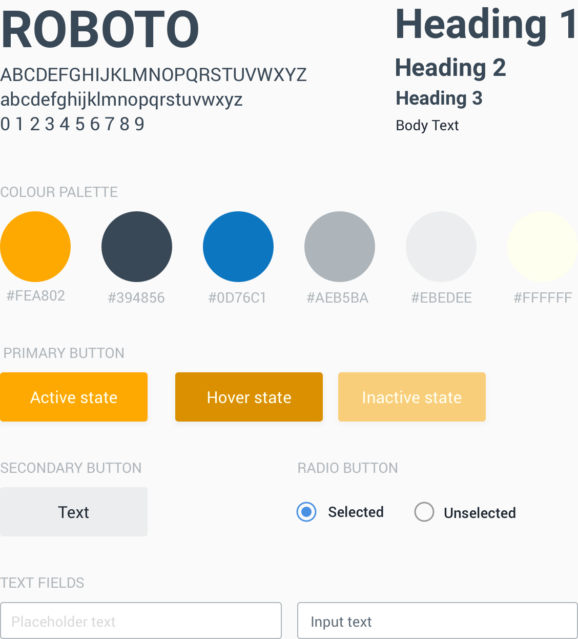
1. Creation of a style guide & modernized UI assets
A key part in improving the overall UI included the creation of a style guide, which would allow Constant Contact to maintain consistency of their assets and fonts used across the platform. When there is a lack of standardization, users need to consciously think about each incremental decision they are making and this could lead to quicker fatigue as they navigate throughout the platform.
From a branding perspective, this inconsistency also creates distrust between users and the brand. Implementing a style guide to promote consistency is crucial in improving users’ overall experience.
2. Revamped Dashboard
A warm salutation and a Dashboard title were included to communicate to users that they were on the Dashboard page
Because all users indicated they tracked campaign performance, we incorporated an analytics graph to ensure crucial campaign statistics were displayed prominently and visually for easier consumption.
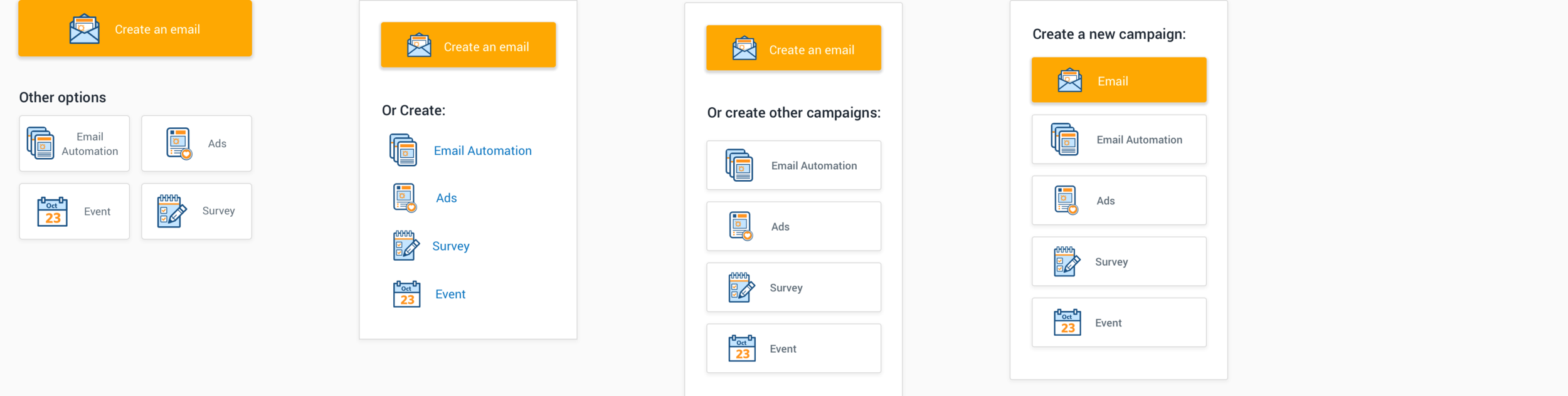
The unnecessary two-click process of creating a new campaign was reduced to one by simply laying out the 5 campaign options directly on the dashboard, improving the efficiency of the process.
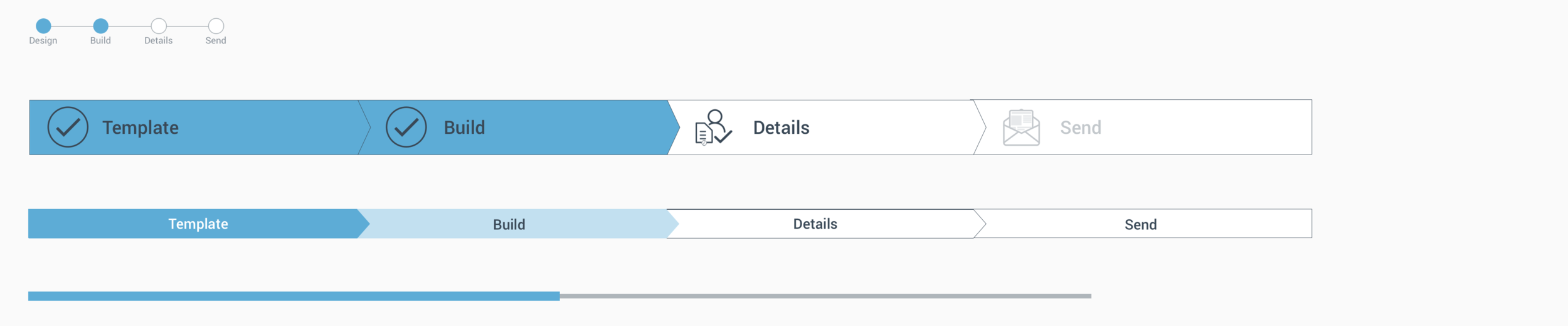
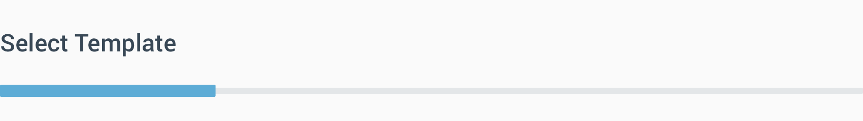
3. Added progress bar
A progress bar was added to each step of the campaign creation pages, allowing users to gauge their progression through the creation process.


4. Organized template layout
Recently used templates were displayed prominently at the top of the page for quick access, as experienced email marketers indicated they used custom templates almost exclusively.
For beginners, the standard templates were organized into categories and the search bar made more prominent to allow for efficient browsing.
5. Improved email editing process
The number of steps required to replace and edit images was reduced from 10 clicks to 5, as this was a major point of inefficiency for users.
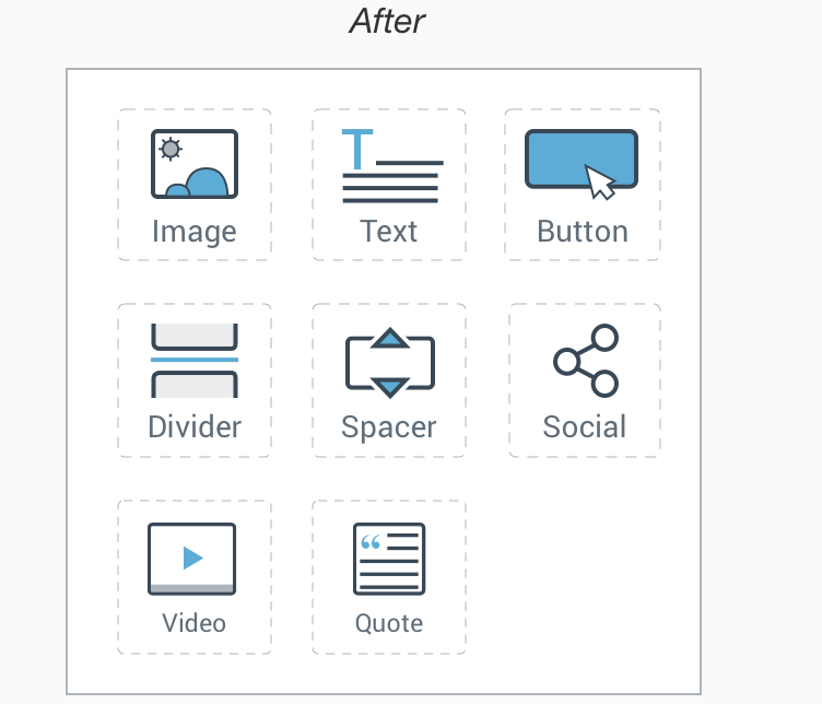
Further, action blocks on the side toolbar were changed to ensure the drag and drop feature was more obvious.
KPI’s: THE IMPACT
25%
Reduction in number of clicks
73%
Reduction in time to complete user flow
83%
User satisfaction rating, up from 78%
FINAL PROTOTYPE