
Instagram is one of the leading social media platforms worldwide with over 1 billion users. Amongst the platform’s user base, content creators are a notable user group with multiple areas of opportunities to explore.
I collaborated with two other UX designers for a group project to tackle the challenge of designing a new feature for the top-performing platform’s content creators.
TIMELINE
8 Days
ROLE
Research, personas, wireframing, UI, usability testing, prototyping
TOOLS
Whimsical, Sketch, InVision
PROBLEM
Small-scale content creators struggle to effectively promote their content on Instagram.
SOLUTION
A subscription-based promotional toolkit feature that provides small-scale content creators with advanced analytics and a strategy guide.
. . .
EXPLORING AREAS OF OPPORTUNITY
Online Surveys & Interviews
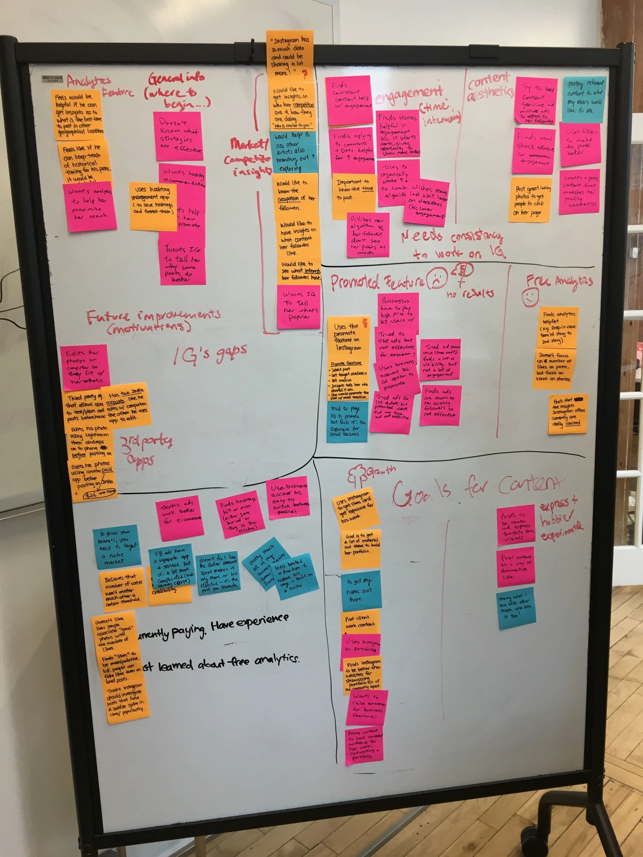
We kick-started the research process by surveying Instagram users in order to formulate a picture around their habits, pain points, and motivations. The data was synthesized via affinity mapping and we identified content creators as a user group with an area of opportunity.
To further understand content creators’ goals and motivations behind using Instagram, a second round of user interviews and affinity mapping was completed.
Business Analysis
Currently, the Instagram algorithm benefits those who are actively engaged on the platform and have a large following. Micro influencers with 2000 followers and above have enough engagement to start charging brands for their posts.
Instagram has demonstrated that it is continuing to direct its efforts towards marketing to its influencer user group through the exploration of the new Creator Account feature.
KEY INSIGHTS
Small-scale content creators for the purposes of our project were defined as those with below 2000 followers and continuously working towards building up that following to gain traction on the platform and promote their brand.
Our data revealed that most small-scale content creators found it difficult to run ads on Instagram. The dollar-spent to value-received relationship was not justified. Most believed paid ads were more beneficial for large companies with big budgets rather than small independent businesses who were pulling money out of their own pockets.
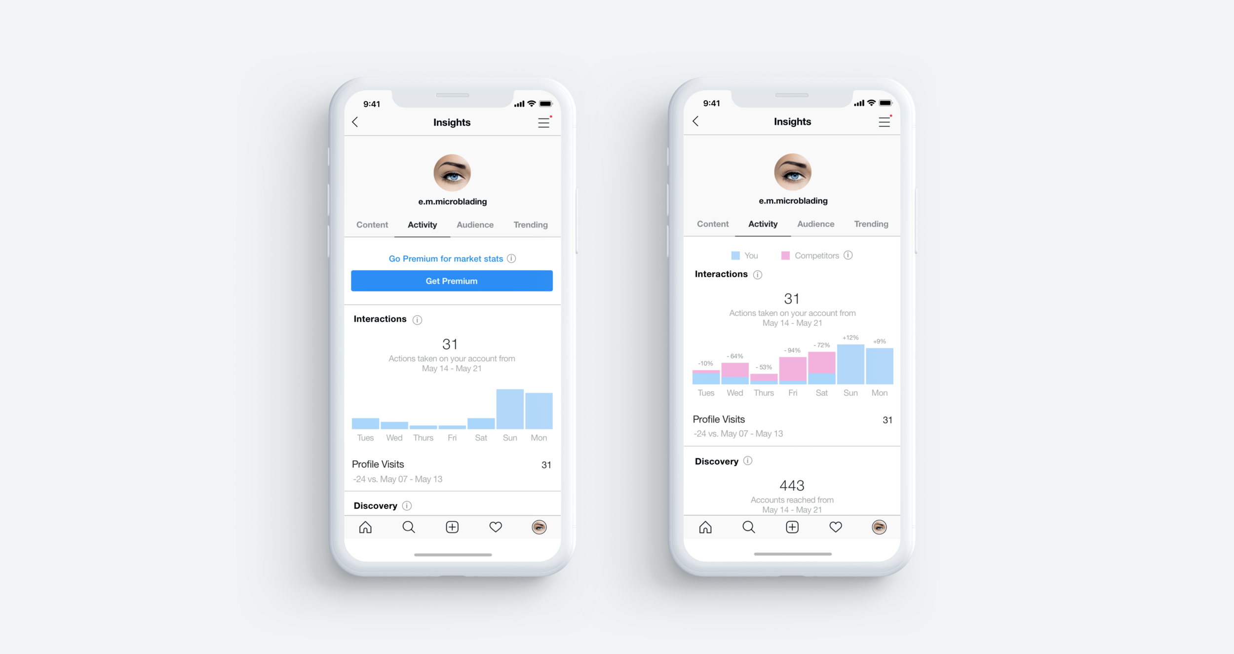
Users also struggled to determine how to increase engagement on their posts and maximize their reach. Many of the strategies were learned through trial and error, which was an extremely time consuming process. The current analytics available on Instagram did not provide sufficient information on their posted content, followers and competitors targeting a similar market.
OUR CONTENT CREATORS
We crafted 3 user personas based on our user insights.
Emma the Advanced user
Pascal the Intermediate user
Hailey the Beginner

CONVERGING ON A NEW FEATURE
We ideated several different possible features before finally settling on a subscription-based promotional toolkit for small content creators.
This would be a complementary feature to the existing promotional ads small content creators were already paying for. Users can receive further guidance on where to direct their time and effort and how to effectively craft their strategies for a small monthly fee.
This new promotional toolkit would provide a new revenue stream for Instagram. For those who stopped paying for promotional ads, this would be a way to reintroduce them back into the revenue stream.
The promotional toolkit would have 2 parts, advanced analytics and a strategy guide.
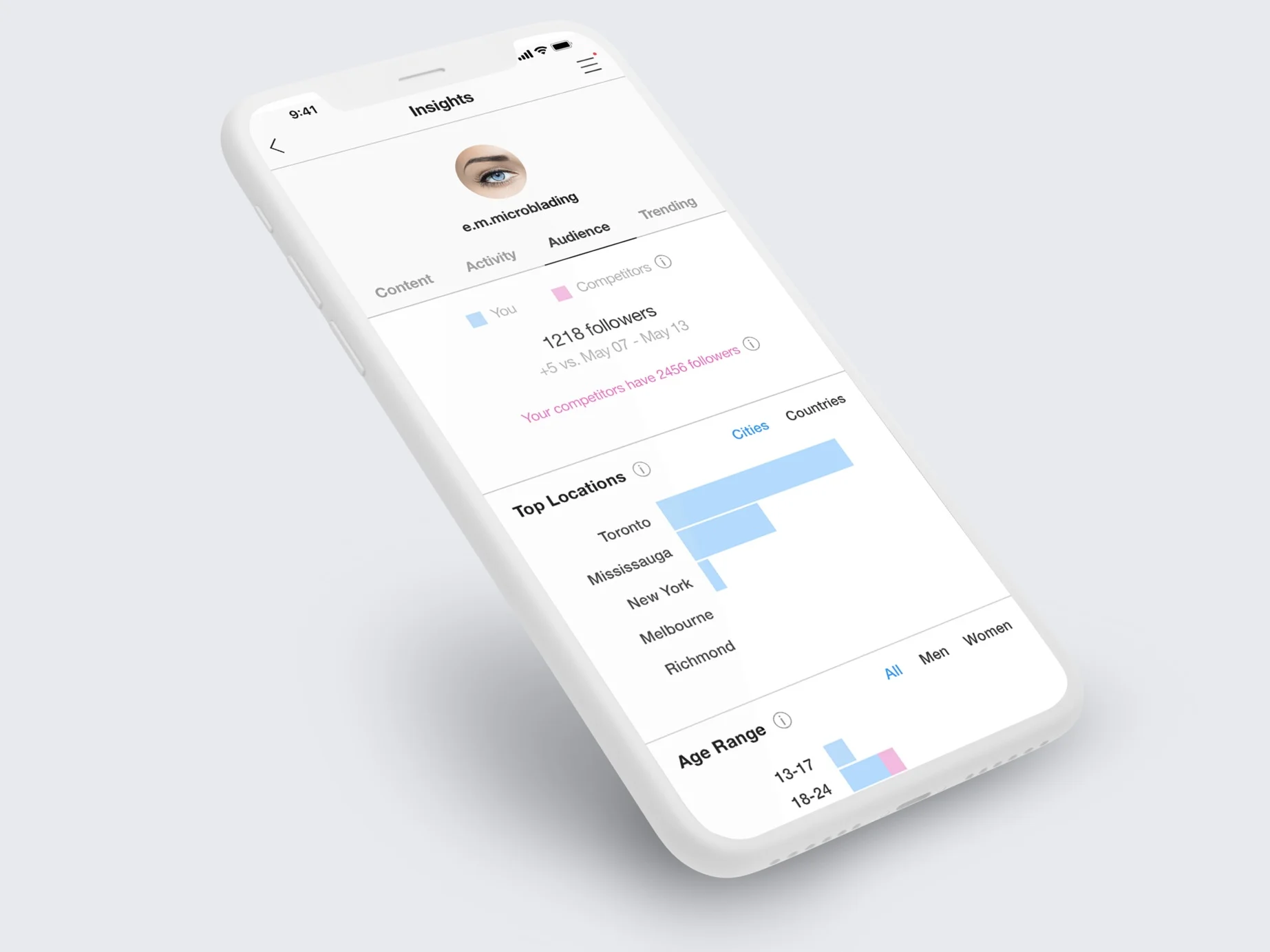
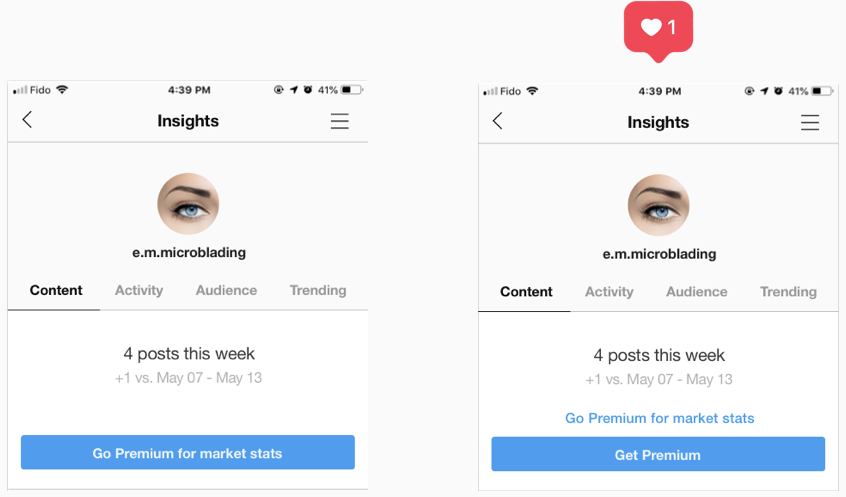
Advanced Analytics
Because users wanted to gauge their performance by comparing their data to their competitors’, market and competitor data would be included as part of their advanced analytics package.
A trending page was also included to allow users to see top performing posts in their industry.
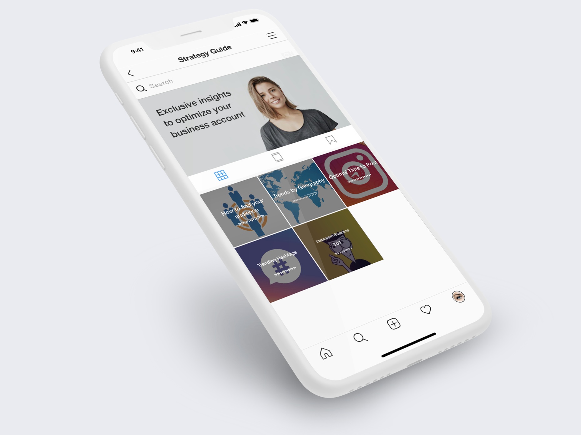
Strategy Guide
Users indicated they struggled with learning new strategies to promote their content. Furthermore, once they discovered an effective strategy, they struggled to keep up to date with the constantly changing environment.
The strategy guide would support users ranging from beginner to advanced, providing content such as trending hashtags, information by geography, etc. All of this information would be pulled from Instagram’s internal data and would be updated on a regular basis.
User Flow
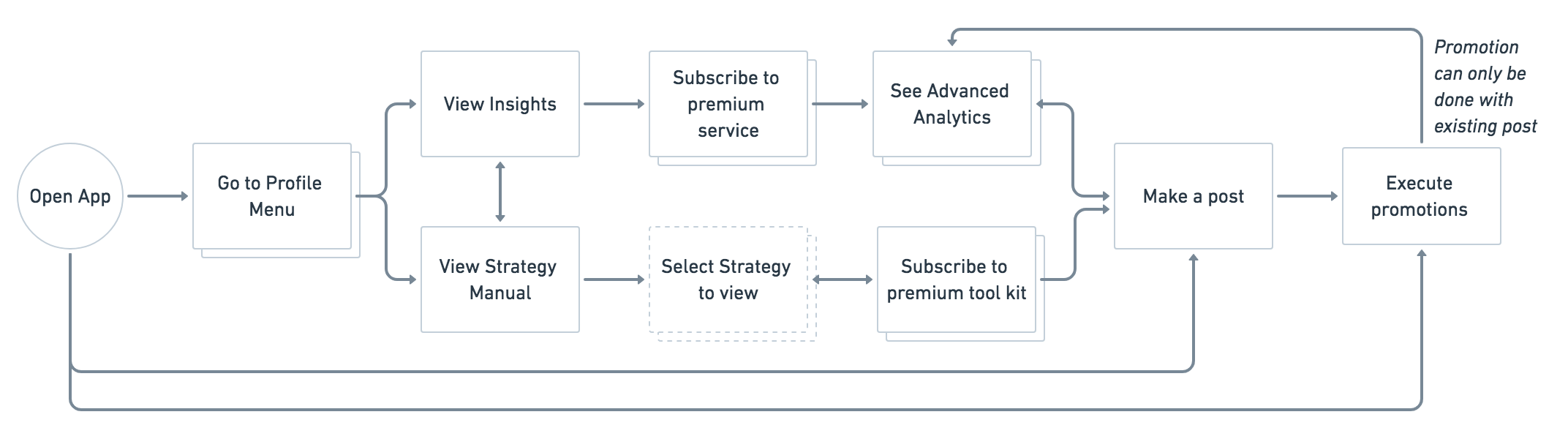
TRANSLATING IDEAS TO SKETCHES & PROTOTYPES
Initial screen flows were sketched on a whiteboard to allow for quick changes. We wanted to ensure the new feature was well integrated with the current Instagram aesthetic without interrupting the overall user experience. The advanced analytics would appear seamlessly alongside the current analytics provided on the platform. The strategy content would be presented in a similar visual format to the current content on the platform.
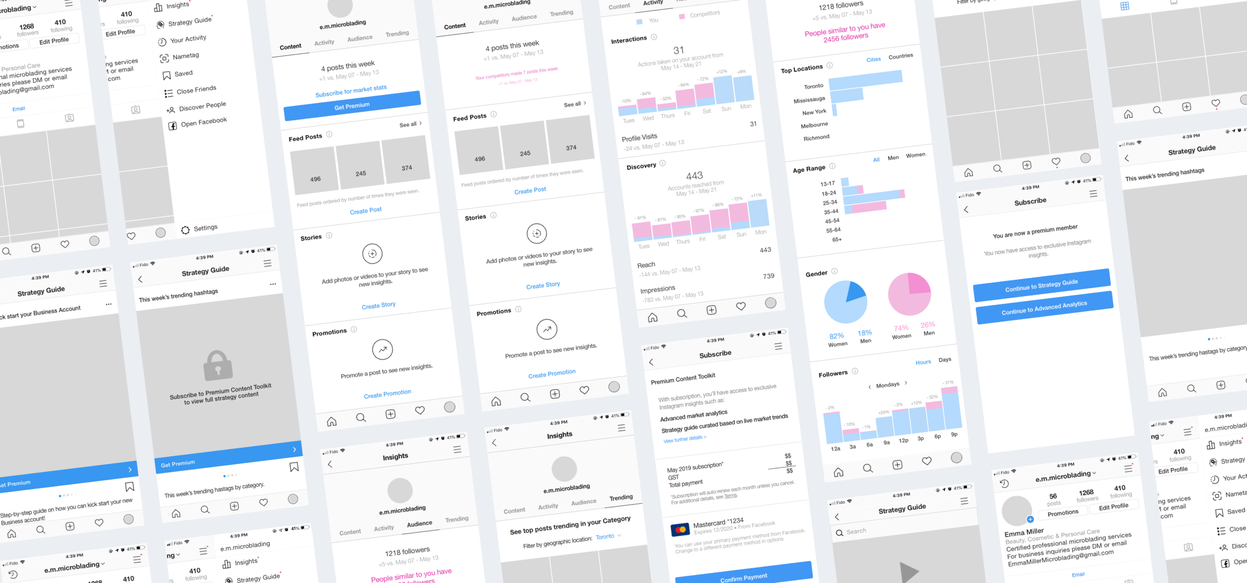
We then moved on to creating mid-fidelity wireframes on Sketch so we could push our testing out to users as soon as possible.
TEST, ITERATE & REPEAT
The first round of testing was completed using mid-fidelity wireframes.
1. Contextual Inquiry
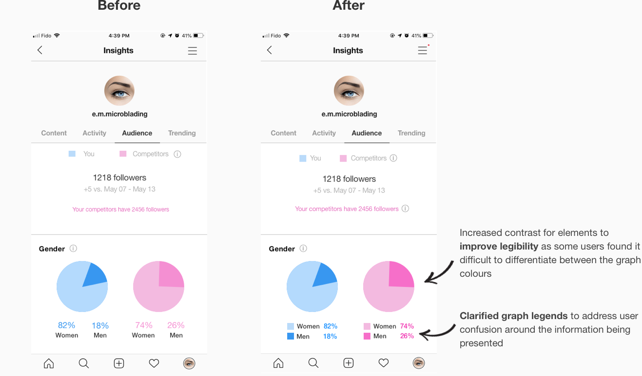
Contextual inquiries allowed us to evaluate the intuitiveness of the screen flow and the discoverability of information. We also gathered feedback on the presentation of the additional analytics users wanted to see. It was a tricky balance between providing too much visual clutter and causing cognitive overload, to providing too little information and not effectively communicating the purpose of the analytic.
2. A/B Testing
With A/B testing, we tested the clarity of the design language and the consistency of the UI and button placements with Instagram’s current branding. Some of the A/B tests are shown below:
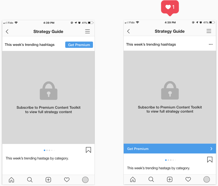
A/B test #1: 69% of users preferred the placement of the CTA on the right because it is more visible and consistent with the current Instagram branding and aesthetic.
A/B test #2: 58% of users preferred the UI of the CTA button on the right because the language is more clear and concise.
Iterations
With the feedback received, iterations were made to the design and high fidelity wireframes were created for further user testing.
A summary of the iterations include:
Organized strategy content in reverse chronological order to maintain consistency with current Instagram layout
Adjusted screen flow to ensure user experience is not disrupted after subscribing
Added drop down arrow to make filters more apparent
Changing icons to be more consistent with the existing style of Instagram’s assets
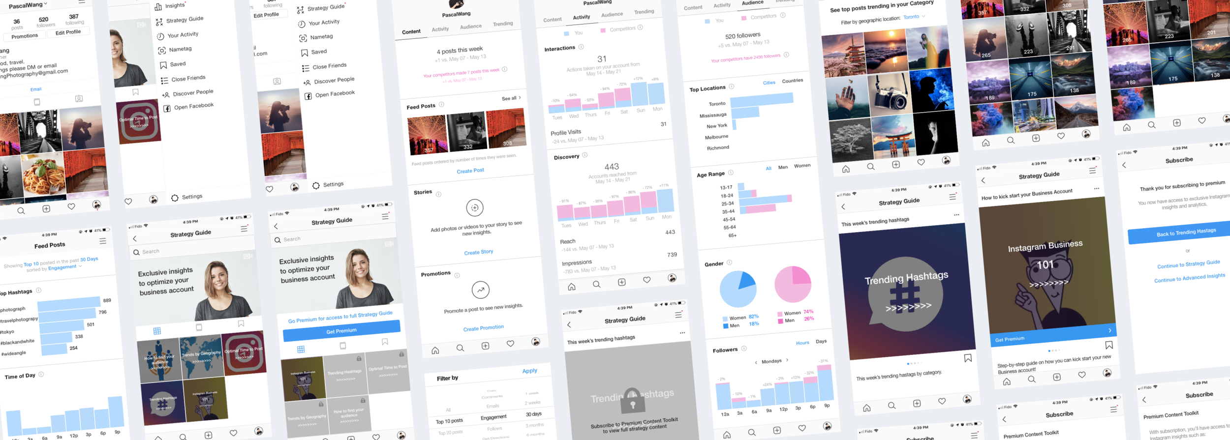
FINAL PROTOTYPE
VIABILITY & KPIs
In addition to testing the intuitiveness of the feature and its alignment with the Instagram brand, it was important to consider the viability of this new feature and test the market fit.
Users that we interviewed all indicated they were interested in using the feature and would pay between CAD $5 to $40 for the monthly subscription service.
For continued performance measurement of the feature, it would be helpful to look at the following:
Conversion rates – percentage of users subscribing to the new promotional feature
Churn rates – percentage of users unsubscribing from the feature
NEXT STEPS
In an ideal world, we would have access to the extensive amount of data on Instagram’s users from their internal database. Moving forward, some additional aspects to explore include:
Conducting contextual inquiry with more target users to continue to identify areas of improvements in navigation and layout
Allowing target users to try for free before subscribing
Partnering with large influencers for strategy content