Zara is one of the largest international clothing brands with locations in over 88 countries.
It has established itself as a fast fashion brand, staying on top of the latest trends with its rapidly rotating inventory sold at affordable prices. Because of this, it is important for customers to easily browse new products so I teamed up with two other UX designers for a group project to redesign and improve Zara's online shopping experience.
TIMELINE
1 Week
ROLE
Research, personas, wireframing, UI, usability testing, prototyping
TOOLS
Whimsical, Sketch, InVision
PROBLEM
Customers struggled navigating through Zara’s website to locate and purchase products, creating an unenjoyable and frustrating shopping experience.
SOLUTION
Optimize Zara’s navigation and checkout process to provide customers with a more efficient and pleasant shopping experience.
RESEARCH
Business Analysis
Zara has built up a very loyal customer base through its uniquely successful business model. It focuses on the customer experience, ensuring a highly curated product line is consistently being rotated through its inventory. They place an emphasis on providing a frictionless experience within their physical store locations, allowing customers to shop quickly and efficiently to find new products.
However, based on the insights from our user research, their website does not provide a consistent quick and easy shopping experience. Zara’s website maintains an editorial style. While this looks great visually, it’s not good for customers, or Zara’s business for that matter, if customers cannot locate and purchase the products they want.
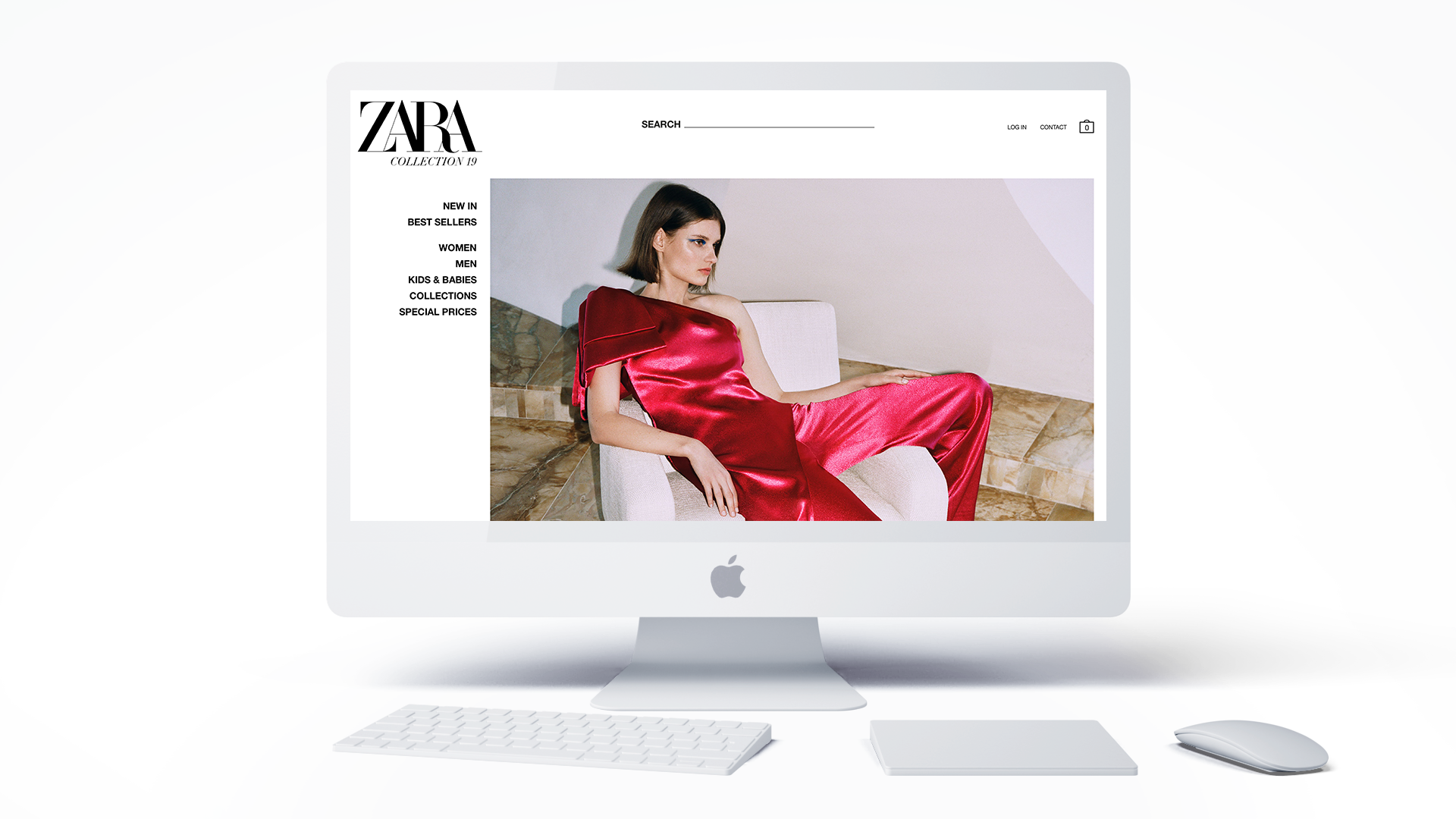
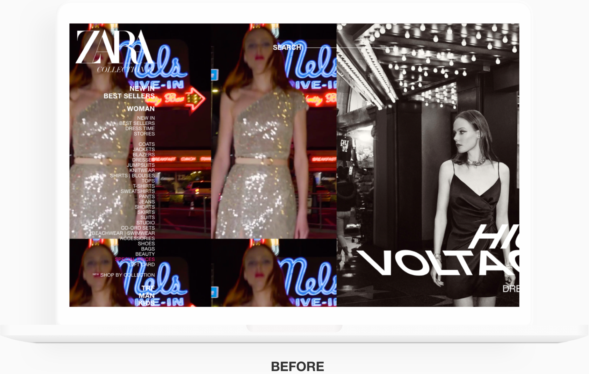
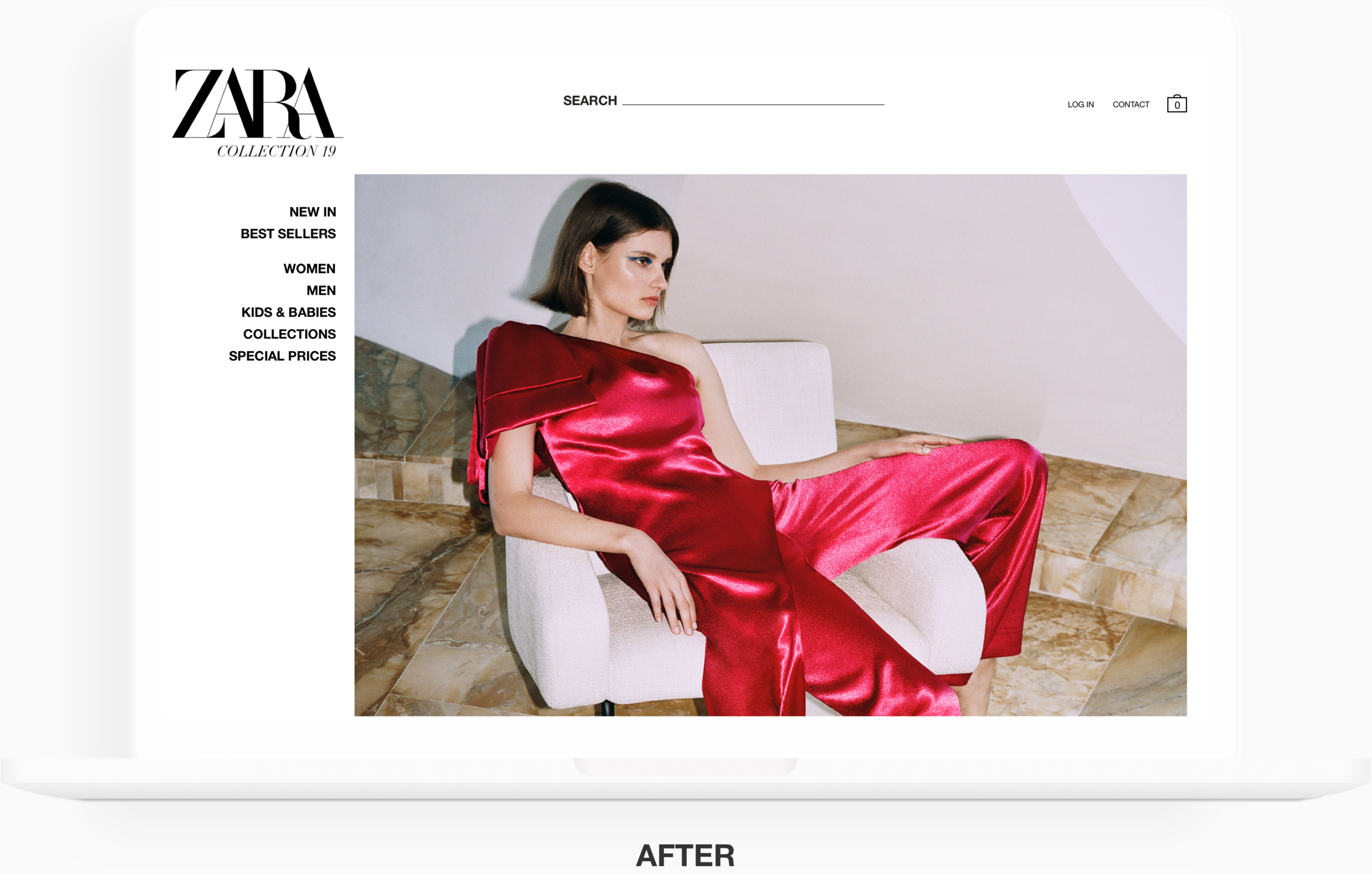
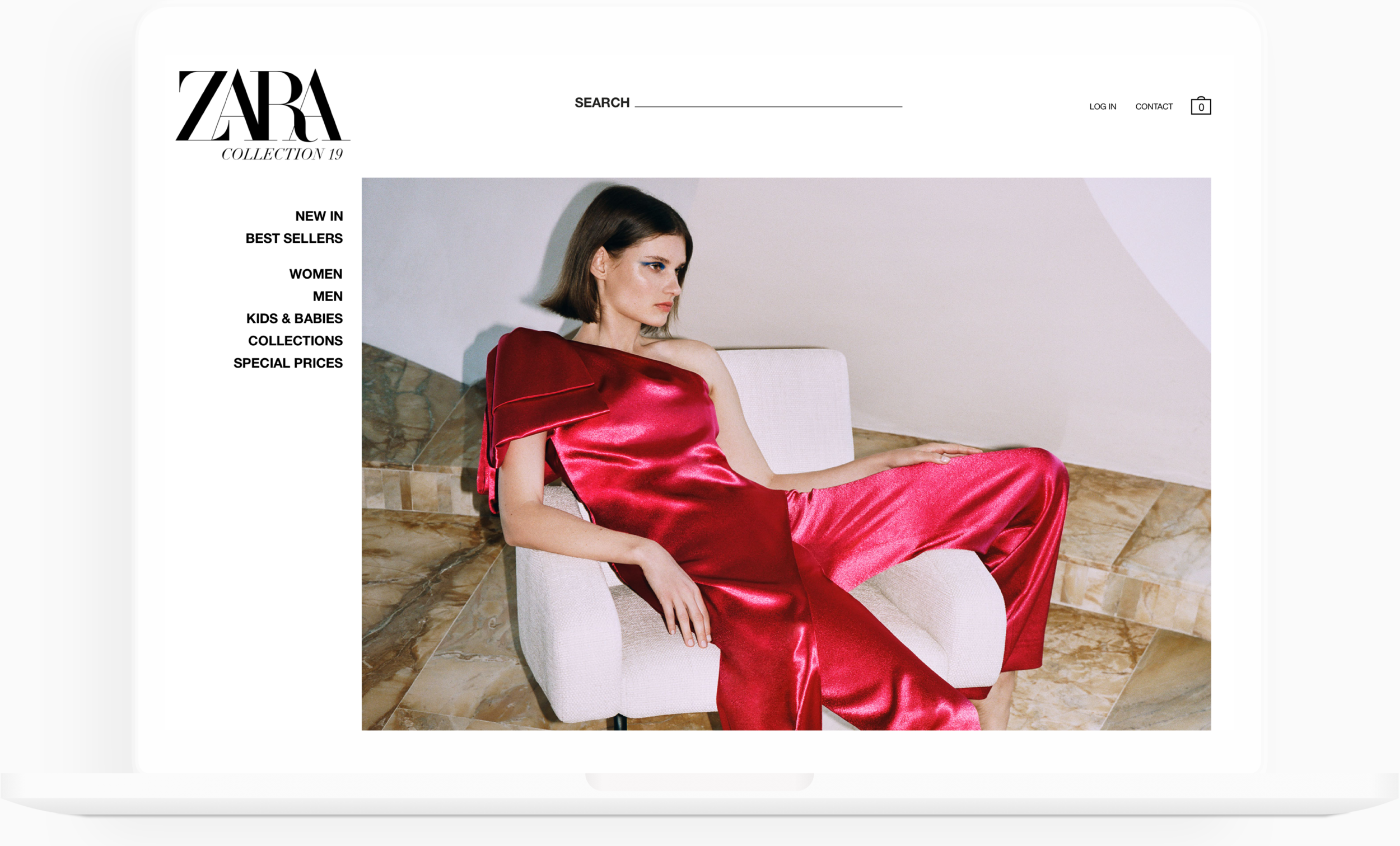
ZARA’S CURRENT LANDING PAGE
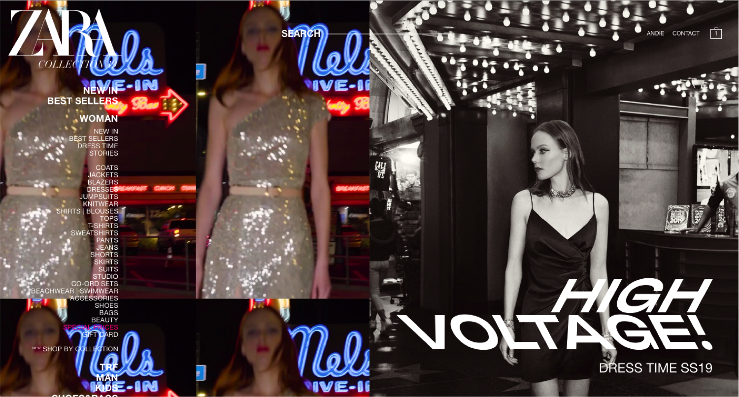
For our user research process, we wanted to first pin point the key areas customers had frustrations with when trying to make a purchase on Zara’s website. We focused solely on the Women’s category of the website due to the short 1 week time-frame.
Contextual Inquiry
We first asked 17 customers to locate a specific product using Zara’s site navigation and proceed through the checkout process to observe how users interacted with the site. To test the site navigation, we asked all users to locate the same product without the aid of the search bar. Follow up questions were asked based on any observations that were made during completion of the tasks.
Survey
Users were also surveyed upon completion of the contextual tasks to gauge their satisfaction and the overall intuitiveness of the site.
“Zara is one of the websites I usually tend to avoid, even though I am a pretty regular shopper.”
KEY INSIGHTS
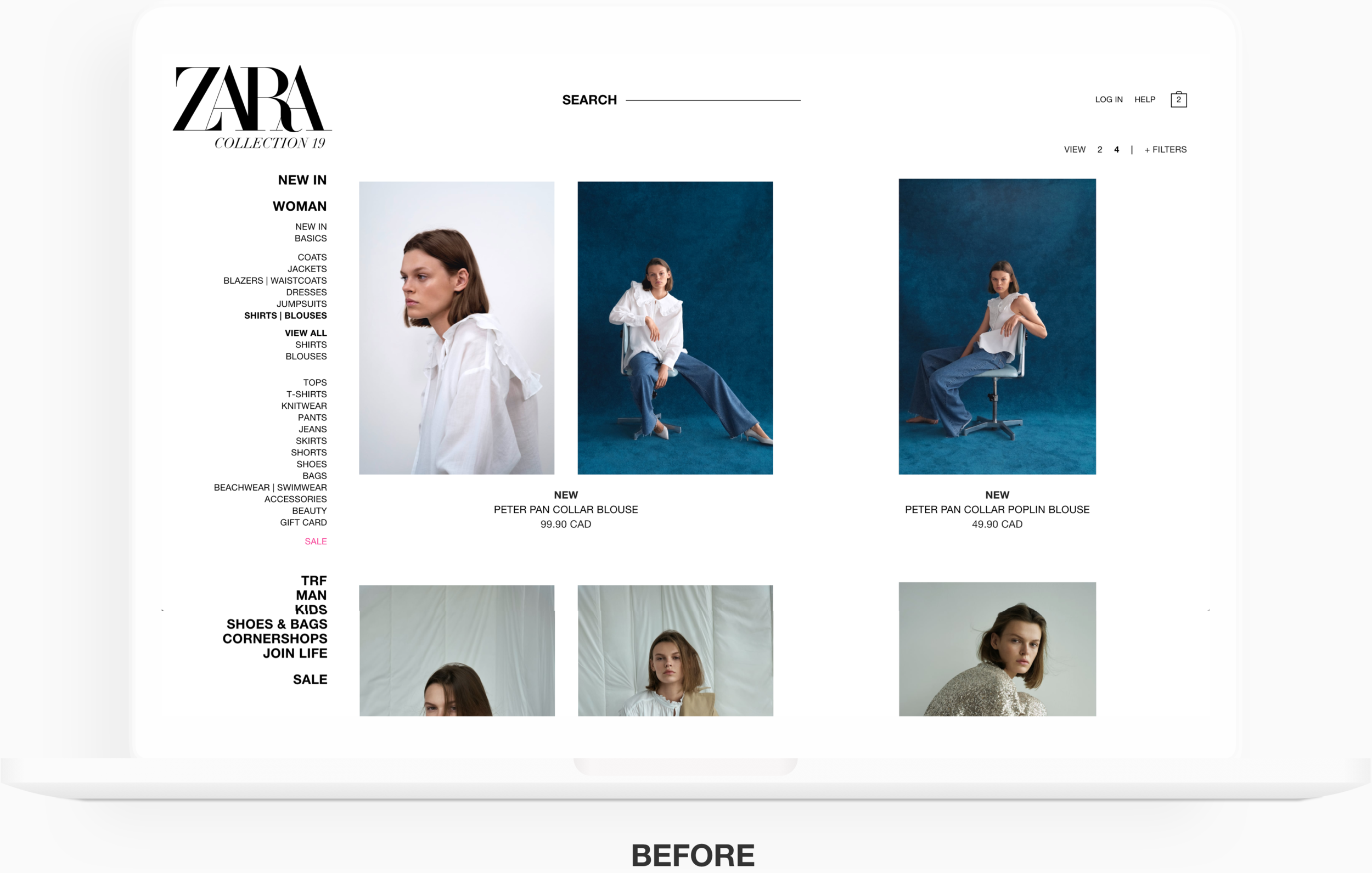
Navigation categories were unclear and overwhelming.
Product layout was inconsistent.
Images were overstimulating, which made it hard to read the copy.
Mandatory fields for the checkout process were not clearly marked and error messages were not helpful in guiding shoppers how to resolve error, making the checkout process tedious and inefficient.
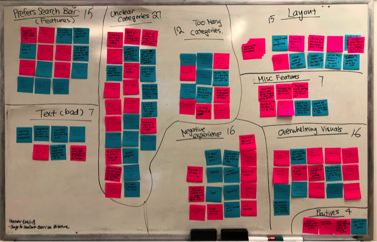
One of the largest pain points for majority of the users was the overwhelming number of categories they were presented with in the navigation. On top of that, category labels were unclear, making it difficult for them to locate the product they wanted.
Site Mapping & Card Sorting
We created a site map to get a clearer picture of Zara’s current navigation so we could determine how to start re-designing the process. We also asked users to complete an open card sort to help us re-categorize the navigation.
Competitive Analysis
We wanted to see how Zara’s competitors were fairing in the race so we created a landing page feature analysis and also looked at how products were being categorized in each competitor’s navigation.

PERSONAS

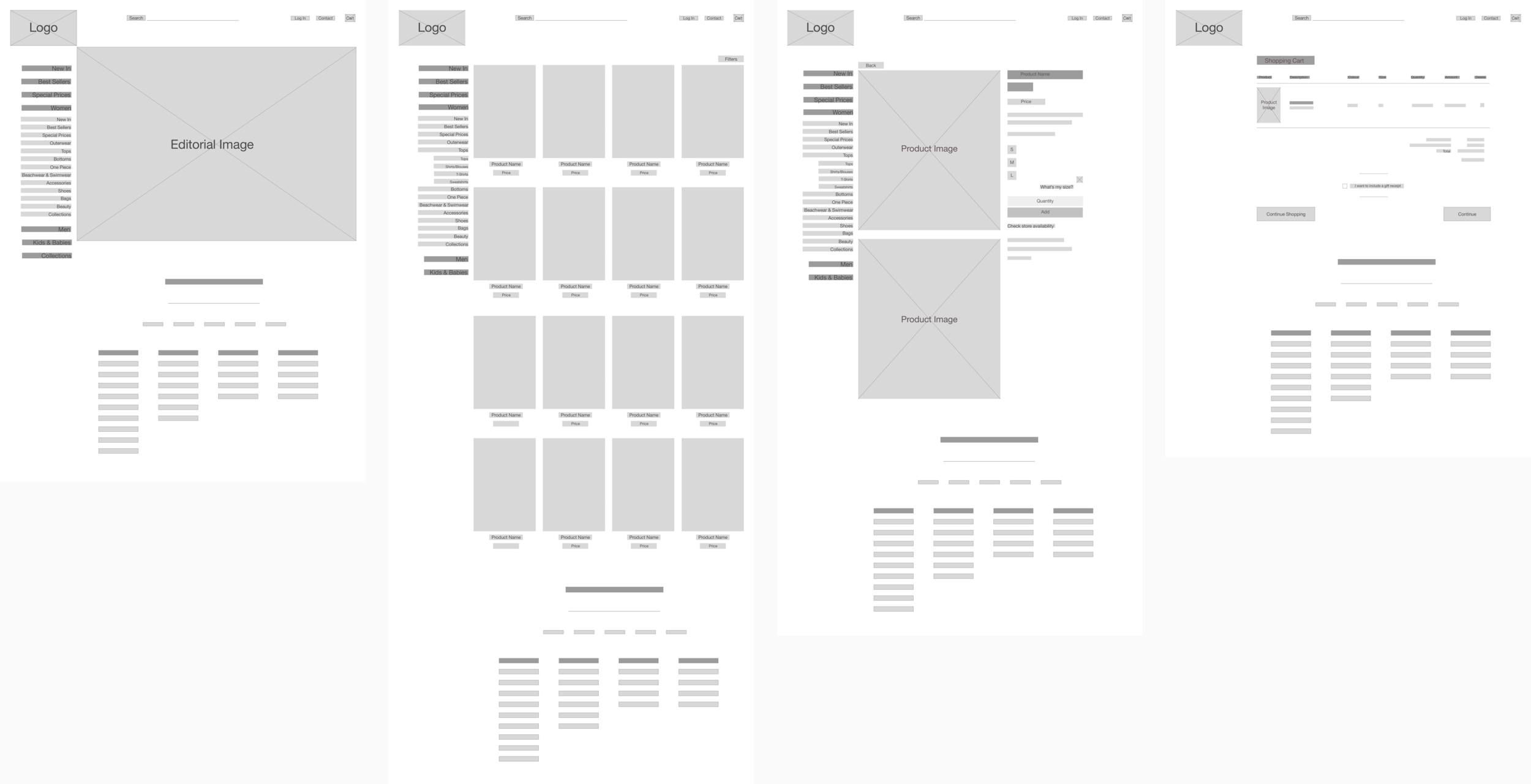
IDEATION, SKETCHING & WIREFRAMING
We quickly sketched out some initial redesigns and moved on to low fidelity wireframes to ensure all of us were on the same page. As part of the redesign process, we also created a revised site map.
TEST, ITERATE & REPEAT
We opted to perform usability testing using medium fidelity wireframes and an InVision prototype. Due to the nature of Zara’s industry, it would be difficult to get valuable feedback from users using low fidelity wireframes without any product images and other visuals. After a couple rounds of iterations, we moved to high fidelity for testing.
We used a variety of methods for usability testing including:
A/B test
First Click test
Contextual Inquiries
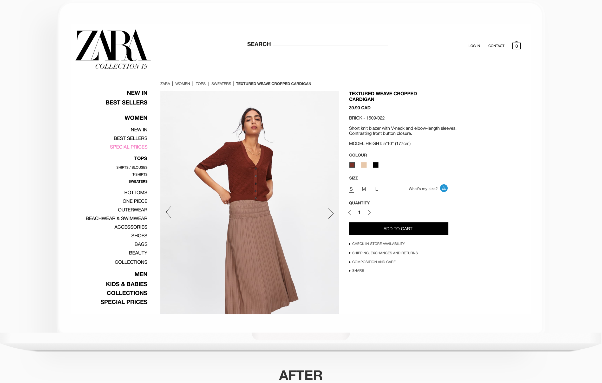
KEY REDESIGN FEATURES
1. Less visually busy
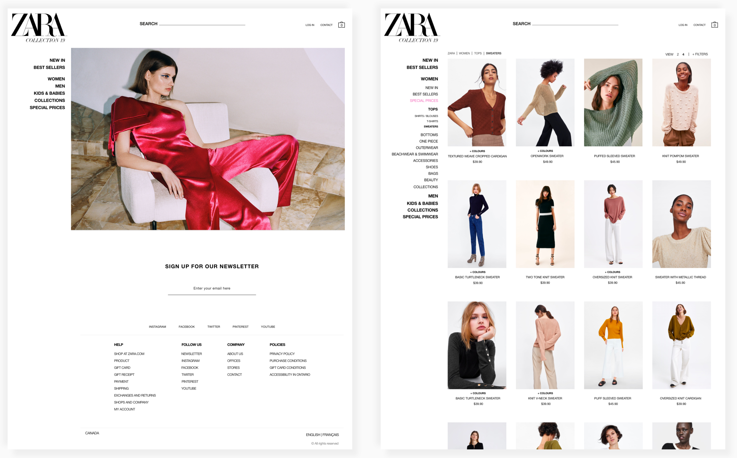
Users had a hard time seeing the navigation on the website due to the flashing graphics and minimal contrast of the text against the background. We addressed this pain point by reducing the image on the landing page and shifting it over to the right, while still maintaining that editorial style.
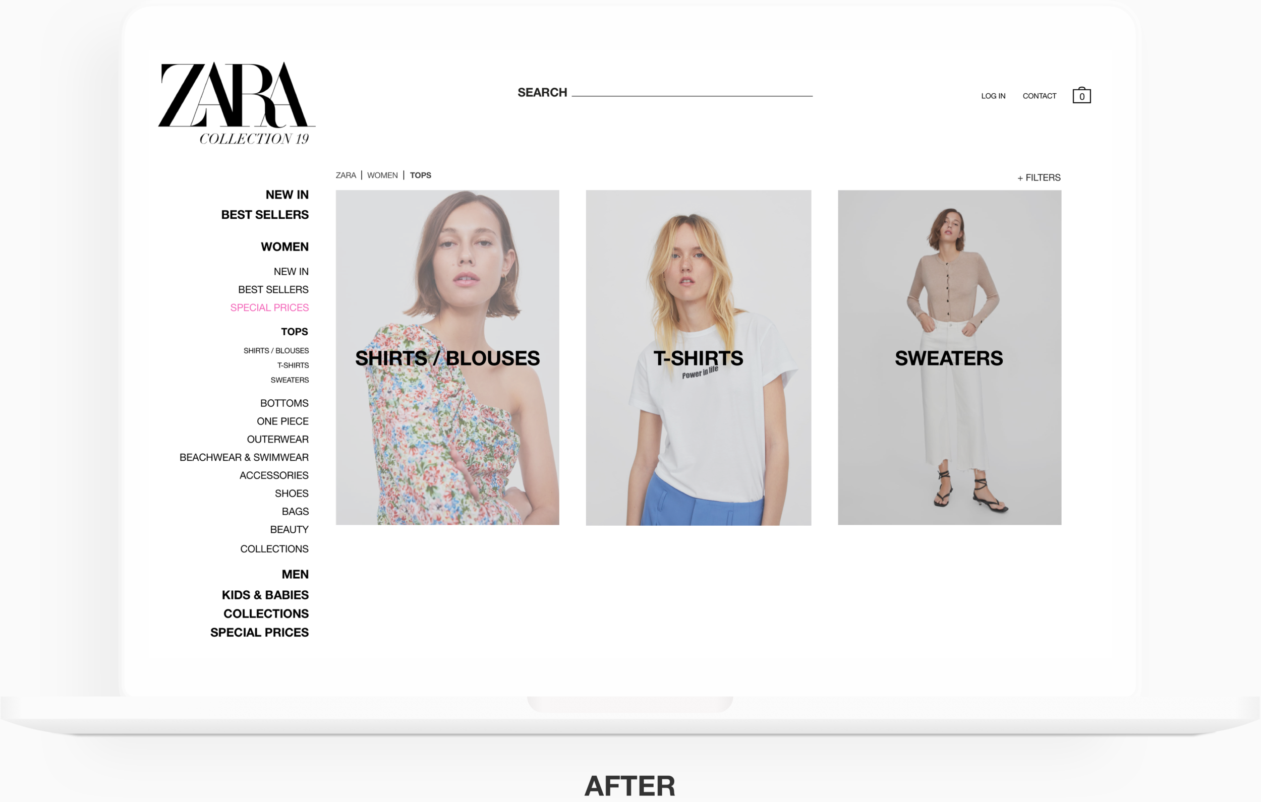
2. Improved navigation: category reduction, visual representation & breadcrumbs
We reduced the number of secondary and tertiary categories within the navigation to mitigate customers from being overwhelmed. During our redesign process, we were cognizant not to take out categories for the sake of reducing the number, and focused on removing only the redundant or unclear ones.
Number of Navigation Categories
We observed during usability testing that users did not notice the tertiary categories within the navigation so we used images to visually represent these categories. This also helps our secondary persona who, for example, may not know the difference between shirts and blouses. Further, the inclusion of breadcrumbs allows users to trace where they are.
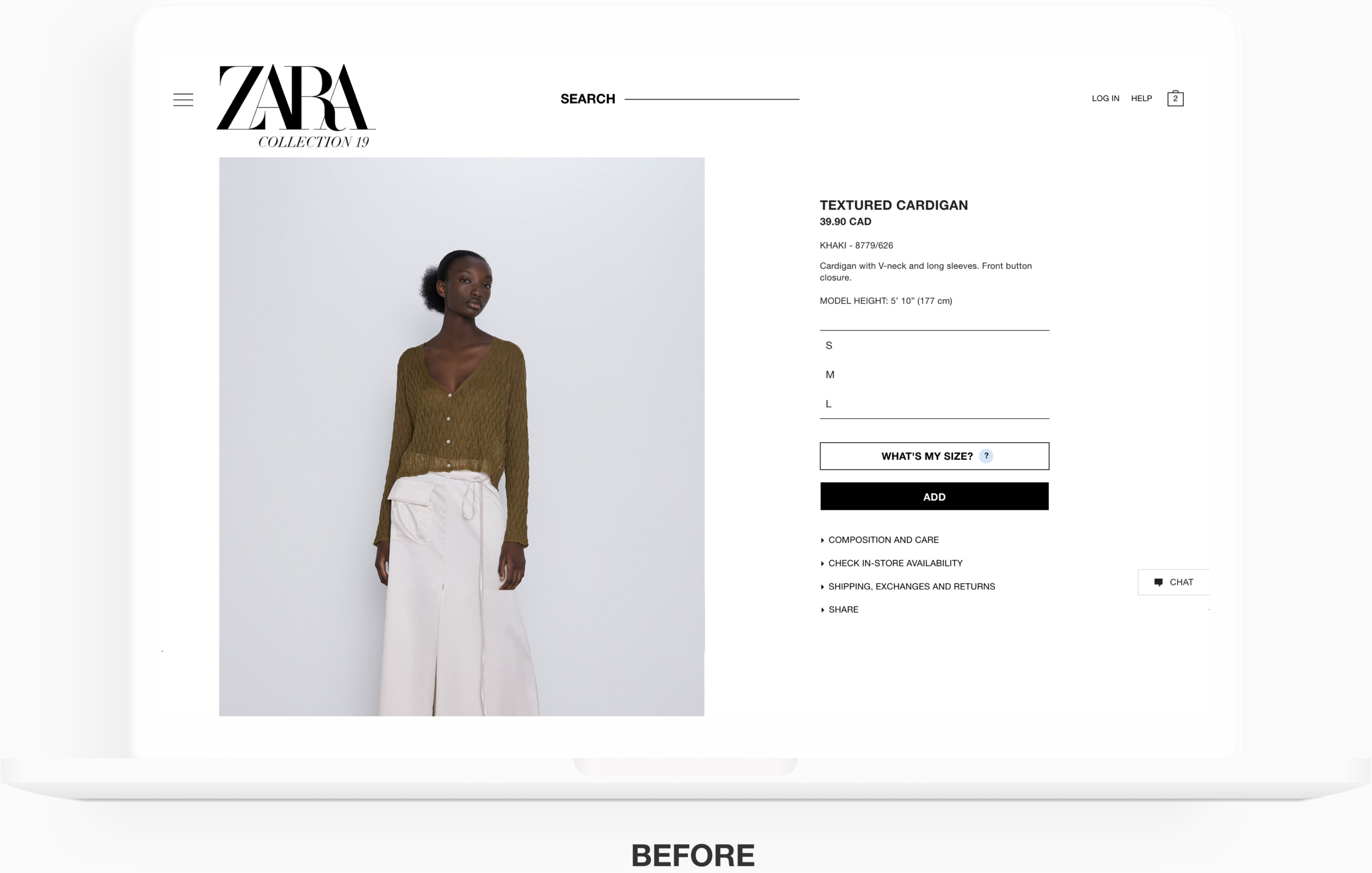
3. Colour and quantity selection included on product page
We included the ability to select the colour and quantity on the product page prior to adding it to the shopping cart to make the process more efficient. On Zara’s current website, users need to navigate to a completely separate product page for a different colour of the same product and quantity can only be selected when users navigate into their shopping cart.
4. More efficient checkout process
The current ‘Shipping Method’ selection process was broken up into different parts of the checkout process, confusing all of the users we conducted research with. To further amplify the inefficiency of this process, error message popups were ignored by users because they appeared in black font. Users were confused why they could not proceed and had to click around the page multiple times before figuring out what they were doing wrong.
We also separated the payment and final review pages to prevent customers from being overwhelmed by the amount of information on the page.
FINAL PROTOTYPE
KPI’s: THE IMPACT
85%
Reduction in time to locate and checkout product
100%
User satisfaction rating
0%
Error rating
Prior to the redesign, it took 4.7 minutes for customers to locate the product and complete the checkout process. After our redesign, customers completed the purchase in 41 seconds.
Users rated their satisfaction with the current Zara website 1.5 out of 5. After our redesign, users gave a 5 out of 5 rating.
Users had an average of 9 errors in their task completion process with the original website. There were no errors made by users with our redesigned website.